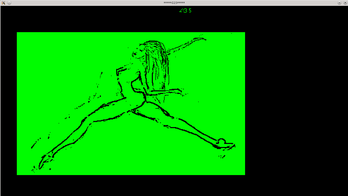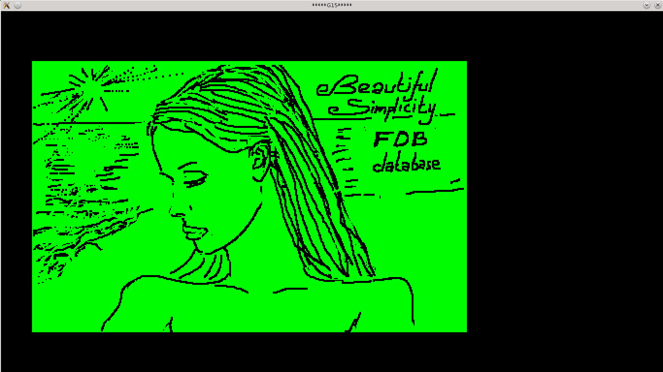

THE STEIN REUSCH WEBER CONCEPT and paintings signed SRW Also called "the Spring BI approach" to art [this completely replaces an earlier text, after considerable more exploration and study, where in some sense I have 'gone back to the roots'] Next two are sketches -- not paintings, but sketches (one previously released within a G15 curveart screensaver, disk L, card 35, so it says 'L35', and the other as startup-image to the G15 FDB program, which it announces as 'elegant simplicity', which it is. Both are done in the Curveart digital sketch tool made in the G15 programming language by same artist) that can lead to paintings. The paintings themselves aren't reproduced here because we rather want them to be seen in real life: the computer monitor has its own idea about colors, and paintings in the real world is a completely different type of colors, and one cannot pretend that the computer can imitate them. But watch the sketches, then, if you like, read the text, and I think the idea will come across. THE STEIN REUSCH WEBER CONCEPT OF ART The concept of art I will propose is of course not my concept at all. So when I pompously say 'Stein Reusch Weber concept of art', I do not mean invention, nor possession, but rather, I wish to say: this is the ripe fruit of a lot of exploration, this is what I put my name to, and stand by, and will continue to do so, it surely seems; also, I wish to say: there are other concepts of art than this, which is the ripe form of what I previously have explored various versions of, also under the slogan of BI Spring art. In that case, B and I meant Black Impressionism, for I wished to emphasize that one can get the fullness of expression of a certain type by engaging in use of black. I have the point of view that at the computer, artistic expression engaging in sharp contrast is eminently right, and continues to be so also when one goes both to practical drawings and to 'the cartoon dimension', what in G15 is called Curveart games, vaguely related to some forms of socalled 'manga'. At the computer, the 'spring' notion connects to the idea that the summer spring has the bright light optimistic green of the young sprouts of many types of plants enjoying the Sun; and this is the very same green that both psychologically and spiritually by, I think, most if not all of those who have really explored the theme deeply, is preferred for wholesome creative PC work. And then, naturally, I wished to expand BI Spring at the PC to the canvas, somehow: and there was no straight way to do so. For green when painted, as also W Kandinsky pointed out, in a book early in the 20th century, isn't nearly as incisive as green light. The substance green isn't always easy, as chemical, to put on something that is to be on a wall. BI Spring when it comes to painting, then, may have to go beyond this color. Those who I regard as in some way mentors, though none of them gurus, of course, have all exhibited mastery in a field, and I have had the luck to have had much contact with several, even in a sense many. I hope I am worthy in bringing on what I have been taught. Without question, I have blended, here and there, what I have picked up from my various mentors, in various fields. When it comes to the field of painting, I have met many painters, but the one that clearly has influenced me much -- also in terms of the possibly hundreds of hours spent philosophising over art in his atelier -- is the fairly influential Norwegian painter Frans Widerberg. For long after the first series of conversations were completed, I spent more time doing computer works, and when I picked up the brush and paint, I felt like doing something, though inspired by him, didn't go as far in vivid use of all three goethian elementary colors as he did: the yellow -- as Widerberg terms 'energy' -- the red -- as Widerberg terms 'matter' -- and the blue -- as the latter speaks of as deep space. I also liked to explore, not just the sharper contrast of black against something vivid like bright green, but also dance in a field of graviation where gravitationless- ness is achieved in glimpses through the mastery of the dancer, rather than by an actual transferrence of the scenery to auric space. Having reached more the completion of many forms of the first forms of computation, in the G15 Cpu platform, I feel that the sum total of all paintings done before, by me, aren't matching up to the fullness of energy that I feel naturally can be wanted outside of the computer, in the real world. Perhaps I wanted freedom to concentrate on programming; now I want to see the paintings shine with the space, and deep blue, and vivid auric goethian colors where the root-teachings of master Widerberg comes into consciousness again. However, dance has given me a sense of interaction between the shapely feet of a slender dancer girl, and gravitation. The also butoh-inspired Norwegian maestro I also has been so lucky as to have photographed some times, the dancer Monica Emilie Herstad, has a philosophical sense of dance unusual to find in most professional textbooks on dance. A number of conversations over a prolonged time makes me want to include her in the list of mentors. And I feel that, if there is something I can contribute with, which is new in the 'SRW' signature -- it is that nothing that comes from my hands is without dance, however pompeous it may be to say it. * * *
Want to see some of them on the computer after all? The following photos of SRW's paintings from atelier 2014 convey only very approximately the exact colors. The choice of acrylic is twofold: [1] it allows a togetherness with the paintings while other activities goes on, so that one can work and rework the paintings the following days as a tight process. While they do not provide automatically the shine of oil colors, there is the challenge to create by painting that shine, instead of getting it through its chemistry. [2] it allows paintings to be finished faster, and thus at somewhat greater quantity and at a lower price than that typically associated with oil paintings, while not going to that lower standard of expression which litographical printing usually involves. In that sense, something in between oil painting and eg litographical printing 'for the masses' is achieved, which is perhaps at least as first-hand as oil painting. The two canvas types here chosen are, for the smaller ones, traditional canvas type, and for the larger ones, a wooden fiber plate. Sizes are indicated in the jpeg photo files. [The first is but a translated comment from a Norwegian teacher of the young Edward Munch, hanging as a kind of poster in the atelier.] photo 1 photo 2 photo 3 photo 4 photo 5 photo 6 photo 7 Images on this page copyright Stein Reusch Weber